Help Center
With branching, your steps or topics can have different executions depending on the instructions. For example, you can create a walkthrough with multiple results depending on the user's activity or visibility of elements. You can achieve this by using custom buttons, triggers and actions.
In this article, we'll explain how each of these functions works.
How to: custom buttons
Custom buttons are useful when you want to add an option for your users to launch a specific topic, jump to a particular step or deactivate a topic.
Use custom buttons in:
- Welcome message to, for example, give your users the option to launch an onboarding guide or close the popover,
- Feature announcements to launch a new feature guide,
- Webinar invitations to redirect your users to a sign-up form,
- Special offers to redirect your users to a particular page when they can use a code,
- Whenever you want the user to choose their learning path.
How about customization?
For advanced customization of your buttons, you can use CSS code. Feel free to customize it so that it matches your brand's identity. We know how important it is.
Check those articles:
- You can edit the buttons in the Code View,
- You can add them manually as well,
- You can change the appearance.
With HTML and the code view in the Step Options Panel, you can use texts instead of buttons or redirect users to a specific page. Our example:
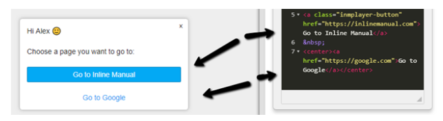
Take a look at this article for more information about custom HTML links/buttons.
If you want to add two buttons next to each other, you can add a table with two columns, one row, and set the border size to zero.
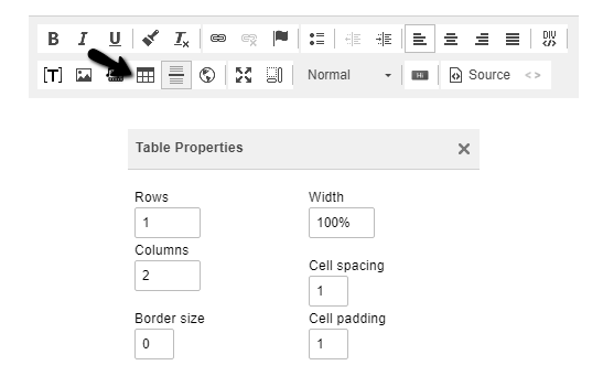
Then add custom buttons in each cell.
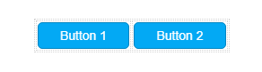
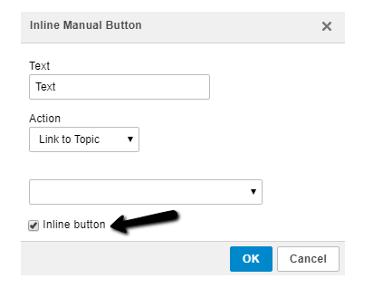
You can use the inline button style here as well. Custom inline buttons are buttons that do not span across the entire step (100%) but are instead based on the text amount.
How to: triggers
With triggers, you can react to user activity and bring them to the next step in reaching their goals. It's an essential component that advances user's progress through your walkthrough. You can respond to actions such as a click or a hover on assigned elements. For example, you can use a trigger on a step which says "if the user clicks the assigned element, then go to another step."
The trigger is made of the following parts:
- An On (event) - what does the user do? Click an element, hover over an element;
- A reaction - what should happen? Jump to a step in the walkthrough, launch another walkthrough or deactivate the walkthrough.
- An assigned element - what are users interacting with within your application? By default, this is the step element, but you can assign each trigger to its element.
Multiple triggers are useful when there are several possible responses to a step. For example, you have two buttons in your application, a red one, and a green one. In your step, you want them to choose between these two buttons. If they click the green button, you want to go to Step two, and if they click the red button, you want to deactivate the walkthrough. In that case, you can have two triggers, with one assigned to each button.
Learn more:
See more about using multiple triggers.
See how to manage drop-down menus with triggers.
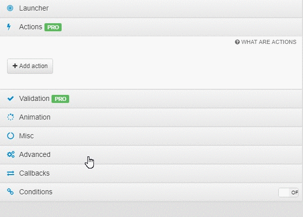
How to: actions
Actions are a time-saver as they allow you to skip a step or branch in a walkthrough based on what the user sees on the page. You have an option to either Go to a Step, Go to a Topic or Deactivate the topic when an element is visible or not. Actions are beneficial when you have some UI elements that are accessible only to specific users like Administrators or Managers. For example, you can create a walkthrough where the second step points at Users tab that is only visible for Administrators. You can set up actions: if the Users tab is not there (an element is not visible), go to the next step. This way, you will need to create just one walkthrough. There's no need to create a separate guide for Administrators and a separate one for Managers. You can set this up correctly in the Authoring Tool while making a step. Please note that Actions are available in Standard Pro and Enterprise plans.
An action is made of the following parts:
- Phase - when Inline Manual will execute the action,
- Element visibility - if an element is visible or not,
- An assigned element - the part of your application,
- Reaction - go to a step, topic or deactivate.